Today I played with a ColorMunki Design, using it with argyll in Linux to record the spectrum of ambient light in the sky as the sun set.
I ran "spotread -a -H -s log.txt" to record using the ambient diffuser, in high res mode (3.3nm per sample instead of 10nm per sample), and recording tab-separated values to log.txt.
Normally spotread waits for a keypress between readings, so I hacked it up to record continuously. It was tricky to figure out how to do that; it took me a while to chase into munki_imp.c, in munki_imp_measure, short-circuiting the loop that waits for user input:
if (m->trig == inst_opt_trig_user_switch) {
m->hide_switch = 1; /* Supress switch events */
#ifdef USE_THREAD
{
int currcount = m->switch_count; /* Variable set by thread */
while (currcount == m->switch_count) {
ev = MUNKI_USER_TRIG;
user_trig = 1;
break; /* Trigger */In high-res mode it reports 380nm-730nm in 3.33nm increments every 3-4 seconds. I let it run in my shaded backyard while the sun was setting, collecting through the ColorMunki's ambient diffuser pointed upward, from 7:33pm to 8:32pm (Sunset was 8:29pm tonight).
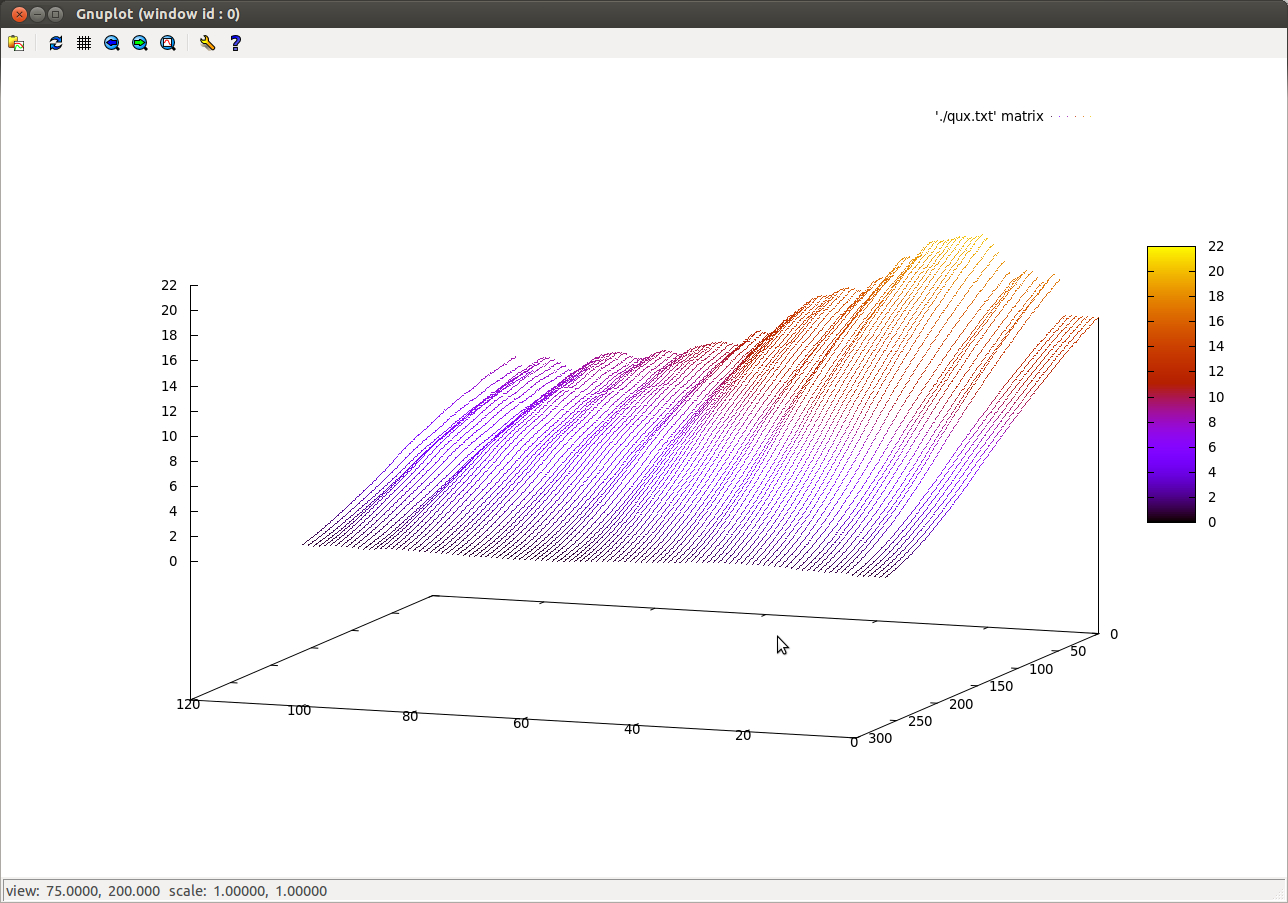
Here's a gnuplot of the data. The colors help see the shape of the plot but have nothing to do with wavelength. Back to front is increasing time (you can see the sky getting darker as the plot comes toward us), and wavelength goes from red on the left to blue on the right. So the main thing that happened during this interval is that the blues were attenuated as it got dark.
To see the spectral shift over time, regardless of overall brightness, I normalized the data so that the max intensity wavelength was 1.0 in each sample. Here's that plot:
(I wish there was a good way to generate an interactive plot, or at least an animated gif).
Here I've rotated the graph around, so that time increases as we go from front to back, and we have red on the right this time with blue on the left. So with the normalization you can see that blue remains the dominant color, but as it gets later in the evening, the reds start coming up (red sunset perhaps?). Overall the curves are pretty interesting -- the shortest blues (relatively) decrease, the greens peak in the middle, and lots of increase in the reds as the sun sets.
It decided to stop after an hour when it decided it wanted to be recalibrated, which was disappointing because it meant it didn't record past sunset.
The gnuplot command for the second plot was this. It took me forever to find "matrix", which lets it accept a data file full of Z values (instead of rows of x,y,z), and "every", which let me decimate to a manageable number of points:
gnuplot> splot './normalized.txt' every 10:5 matrix palette with impulses

